There is nothing that I enjoy more than styling a shelf with my favorite items. Well maybe just a few things, but really when it comes to home design and decor styling a shelf is my absolute favorite thing to do.
I get asked often for styling advice so I wanted to share with y’all a few of my secret styling tips on the matter. I should note that there is no right or wrong way to style a shelf, but there are a few rules of thumb I keep in mind as I am evaluating the space and deciding what I think will look best. They are as follows:
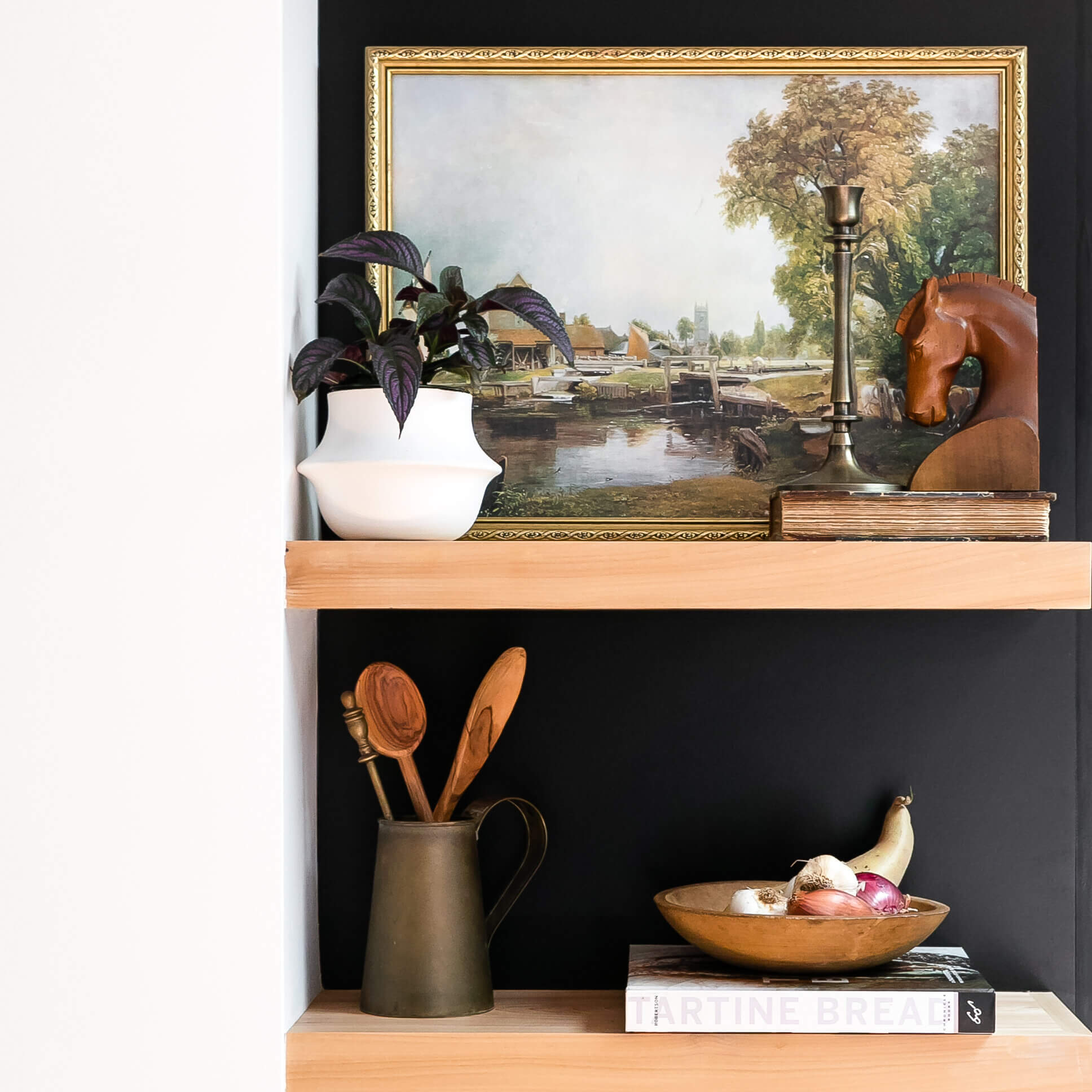
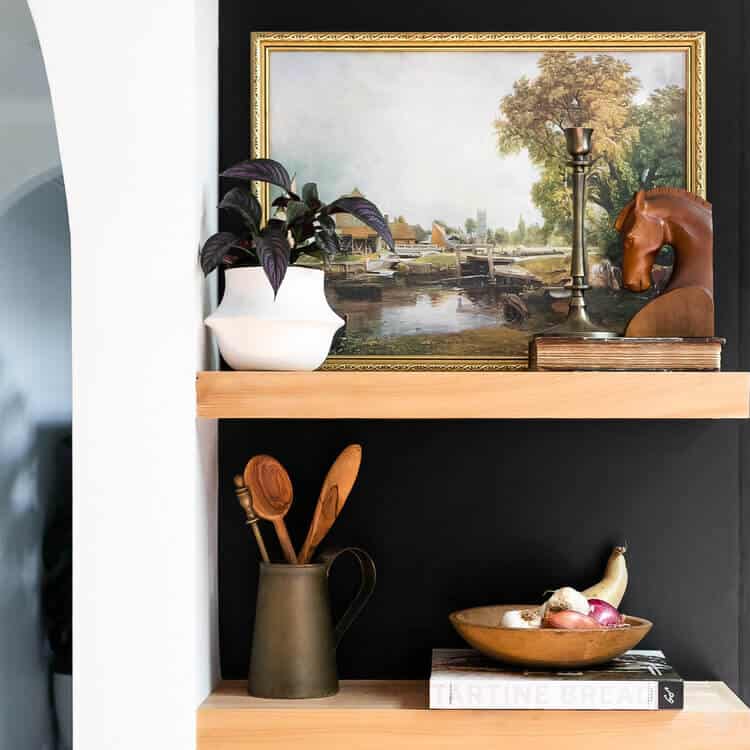
- Gather – Get all your styling items together in one place. Ideally, it’s a mix of your favorite items that are both beautiful and functional. Even better if some are thrifted. Shop your home, Check out my favorites on amazon, take clippings from the garden, and even pull out pots and pans from the kitchen. You would be surprised what you can find that will look amazing on a shelf. For me, I love a mix of old and new items that make sense in the room, in this case, a favorite cookbook and it wouldn’t be a @136home styling project without black and brass. But for you, it could be any color or materials found in items like these favorites; pottery, linens, and wooden bowls.
- Layer – Always try to have items overlap from back to front and from top-down when possible. It’s great when there is a tall piece of art in the ack and then an object or two in front of it. Even better if you can have the object that is placed in front of the art just pushed to the right so that the edge of the objects aren’t exactly matched up. This helps things to look natural and lived in without being too formal and stiff.
- Symmetry – Try to have a balance from top-bottom and left or right. It’s best if you can try to have something heavy up top and then again at the bottom. In the vignette, I have a tall brass candlestick on the top right and then wooden spoons in the bottom left. They are opposite on another as the highest objects and this helps the eye feel “good.” See it?
- Contrast – Try to have things pop. When you have items with good contrast your eye jumps to them immediately, and if you have more than one contrasting cluster in a design your eye will go back and forth between them effortlessly. The way you create contrast is to place an item or two that are the lightest and darkest in front of or right next to one another. You will notice that the white cookbook and white vase (also opposite one another) are placed in the space and the items read immediately. The eye loves this and the symmetry balance they create opposite one another just reinforces a beautiful aesthetic.
- Movement – Good designs have the eye moving all across the landscape. To do this try and vary the height of all objects and cluster smaller objects together tightly. Place elements throughout to fill the visual space to keep the eye moving all over the plane. You never want anything to feel too crowded or worse have the eye get stuck trying to figure out what that cluster of too small of objects is. Shelves tend to look best with fewer larger scale items that the eye can really read. Too many small objects prevent movement of the eye. You can really help the eye rest intentionally and create a feeling of intention by introducing…..
- Negative Space – Don’t be afraid to let there be moments of nothing – seriously. You don’t have to fill every inch of the shelf. If you leave moments of negative space each element will read better and feel much more intentional. I think this is the most common mistake I see. Don’t over the crowd, and by leaving little moments of quiet the entire design will look like it’s right of the pages of Elle decor.
- Mix Old + New – This is personal taste. But, if you are here I think we like the same things! In that case, always mix in something old or thrifted and something new. For shelves in particular I think vintage books from a thrift store always look good. Pay attention to the color palette and choose a spine that in monochromatic and fits into the rest of the space. Or, if you want a pop of color use a contrasting color to shock and delight. like vintage books
- Scale – I mention it above but wanted to make sure scale had its own call-out. Vary up big and small, tall and short, soft and hard. Really the more dynamic ways to include items that vary the better. This is true for textures too. If you do place something tall, don’t place another tall piece right next to it, try to move it to the opposite side of the vignette and create movement so the eye dances across your design.
- Green – I insist on including a plant or some sort in most of my styling vignettes. Branches work too. When you have something green and living in a space it literally brings the space to life. No pun intended. Some house plants are tricker than others. A creeping vine is a great option. You can grab one here.
- Be Creative – You don’t have to spend a fortune to create a beautiful space…
Have you ever decorated with garlic or potatoes? Sometimes, the most ordinary of objects can look the prettiest. A thrifted wooden bowl, filled with garlic, onions, and sweet potato placed atop of a favorite cookbook make the vignette above one of my favorites. For tips on how to thrift like a pro check out this post.
I want to encourage you to remember that beauty is everywhere, always. You might just have to be on the lookout for it.
Go for it guys! Empty off a shelf or bookcase. Gather your favorite finds, and then start styling – You can do it! If you do let me know how it goes and if this checklist helped ya along the way.
Follow along on Instagram for more styling tips, DIY, and San Francisco design inspiration. Also, you can grab some of my favorite styling items here if ya need some help getting started. Thanks for being here and love yall. I hope to see ya in the comments.

Hi, just required you to know I he added your site to my Google bookmarks due to your layout. But seriously, I believe your internet site has 1 in the freshest theme I??ve came across. It extremely helps make reading your blog significantly easier.
Thanks, I loved the final design. It was a lot of work, but I am so glad we took the time to make it fit my style and function properly.