The Design Process
Creating a calm yet bold primary suite is no easy task, even for the most straightforward rooms. Our space posed some unique design challenges. First, it’s a bottom-floor suite with a slightly sloped ceiling, as part of the room is encroached on by the overhead stairs that lead to the space. In addition, the room has a pesky 8” soffit that wraps most of the perimeter of two complete walls that couldn’t be removed. The worst part was that one of the walls had a horrible faux wood treatment that overwhelmed one entire wall. Guys, It was actually flooring. My other half tried to convince me to keep it. It was a hard pass from me.
Table of Contents

Bedroom Archway
With that being said, there were some nice pluses too. The room had a solid recessed lighting system complete with dimmers, and the hardwood floors from the rest of the house continued into the master, promising a seamless transition and cohesiveness for the entire home.
Save this article
Get a copy emailed straight to your inbox.
Phew! A good amount of natural light also came in from the backyard, which helped to reflect some of the greenery into the room. As city folk, we are always looking for more light and nature in any way possible. The yard, however, is a project and post best saved for another day.
The Bed

The soon-to-be miracle master had sufficient space for a king bed and two side tables. For two grown men, coming from 700 sq. ft. and a Queen bed, we were over the moon to finally fight over the covers and have enough room for us to sleep, as well as our beloved Cavalier King Charles Spaniel – Echo.
Tip
Never let a design challenge limit your creativiyt. I’ve always found that my very best design executions were acheived after a struggle with a pesky design problem
As you can see, the room showed plenty of promise, and we couldn’t wait to dive in. Needless to say, we locked our space plan reasonably quickly. The space dictated this rather matter-of-factly. For my process on this, check out our previous post on how to design a room. From there, we were on to the more challenging decisions. Should we build out the soffit? Do we consider just keeping our Queen bed and maximizing floor space (yes, we talked about every option)? A chandelier or not, start with the rug or bed?
You might also like
We decided that we needed to start with a bed and rug. I find it best to start with the rug and bed in the bedrooms. You have to get these pieces right and pull them from to guide the rest of the space.
Pin this article
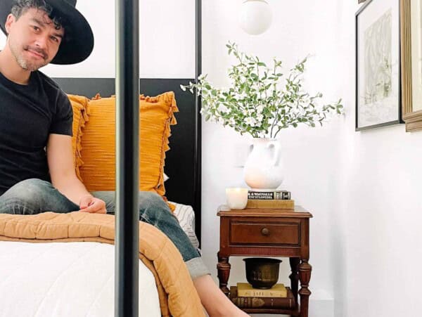
Pin It NowIn the instances where I started with a chair, light fixture, or even statement art, I always feel like the end result seems more disjointed than when I select the rug and bed first. Let’s talk about how to do that HERE. Moving on, we then looked at every possible bed type imaginable—Tuft, Wood, Iron, IKEA, Rejuvenation, custom, four posters, etc. We ultimately decided on the talents of Alex @DoormanDesigns. They are a New Orleans-based design firm with the talent and price point that people can manage. It was love at first sight with the Josephine bed. It was altered the time when we realized that the boys over at Doorman could customize our bed to rest safely over the 8” soffit so that we would save almost a foot of walking space at the foot of the bed – a high-traffic location as it leads to the closet and master bath.
We need Curtains
What we knew was that we needed to find a way to utilize the wasted vertical space from the soffit that took up two complete walls of the room. But what does one do? Add float shelves, cover them with a statement curtain, or even leave them as is. It took some lattes and late-night brainstorms, but we finally decided on the solution.

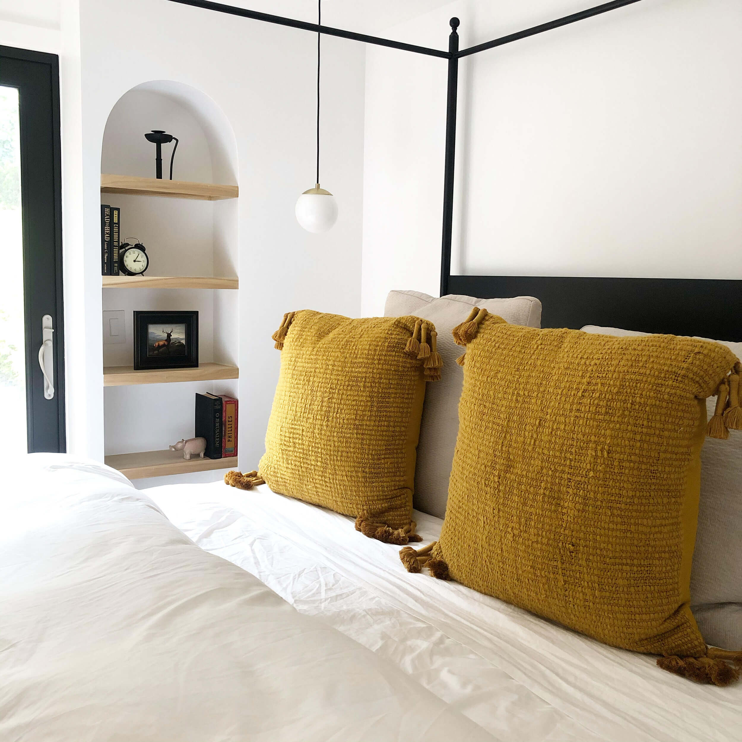
Arches, honey. Arches are the new black. I am always drawn to homes with a bit of charm and character – gravitating towards Tudor and Spanish homes. This house was everything we needed on paper but wasn’t shining on architectural detail. As such, we thought what better way to use the soffit than build up some beautiful stucco arches with 8” deep alcoves to style all of my favorite thrifted finds. These were really affordable and completely elevated the master miracle infusing some much needed character without being forced.
Best flea markets in Orange and SF here:
Tip
R
Wanted to infuse some character – arches, wanted a pop of whimsy, needed a way to make a statement with the bed that allowed us to change the vibe as the seasons of life changed. It was an investment piece. Curtains were neeeded. mix antique. baroque inspired pieces with modern finishes
Styling Accents
- Schoolhouse – Pendanty Lights
- Brooklinen – Comforter and sheet set
- Target – Throw Pillows
- Target – Knitted throw blanket
- Amazon – Waffle White Quilt
- Rugs USA – 8×10 rug
- The Shade Store – Ceiling mounted Drapes
- Tom London bowls
Commonly Asked Questions
Simple start with a plan and execute it. Start with Pinterest etc
Wanted to infuse some character – arches, wanted a pop of whimsy, needed a way to make a statement with the bed that allowed us to change the vibe as the seasons of life changed. It was an investment piece. Curtains were needed. mix antique. baroque-inspired pieces with modern finishes
Wanted to infuse some character – arches, wanted a pop of whimsy, needed a way to make a statement with the bed that allowed us to change the vibe as the seasons of life changed. It was an investment piece. Curtains were neeeded. mix antique. baroque inspired pieces with modern finishes.
Wanted to infuse some character – arches, wanted a pop of whimsy, needed a way to make a statement with the bed that allowed us to change the vibe as the seasons of life changed. It was an investment piece. Curtains were neeeded. mix antique. baroque inspired pieces with modern finishes
In a world where comfort food often gets a bad reputation, loaded sweet potato fries prove you can have the best of both worlds—flavorful indulgence and wholesome ingredients. They’re a testament to how simple, everyday ingredients can be transformed into something extraordinary with creativity. Whether you’re seeking a healthier alternative to classic fries or experimenting in the kitchen, this dish is a delicious and versatile option. It’s not just a meal; it’s an experience that satisfies both the palate and the soul.


